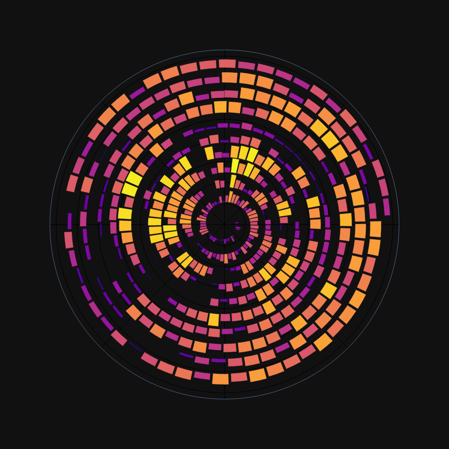
What does a decade of training look like?
I’ve run regularly since around 2004 and reasonably seriously since around 2011. Since 2012 the vast majority of my training has been recorded on GPS watches, and the bulk of this is sitting on Strava databases. With more than a decade of nearly daily recorded activities, there is a treasure trove of data to be visualized.
Certain metrics often summarise periods of time, like weekly mileage. A spiral plot is useful to show long-term trends, particularly with periodic patterns. Therefore, the below plot shows my decade of training as a spiral plot.

11 years of training, with January at 12 o’clock, the mileage for each week shown gradually spiraling outwards with one loop per year. The plot shows nothing I didn’t already know, but it’s nice to have it clearly visualized.
- In my university years, I ran a lot in the Autumn (Sept/Oct/Nov).
- Generally, March-June is my most consistent time of year.
- Injuries are clearly visible. Particularly my 2017 autumn and 2018 winter injuries.
- The last few years have been consistent without needing any periods of high (for me, 80+) mileage.
