Power of 10 - Rankings Comparison
The UK has an excellent tradition of athletics-nerd statisticians tracking results, rankings, and much more. Luckily the track and field database, Power of 10, is available to provide answers to some often debated topics like:
- What’s an equivalent 5k performance to 800?
- How much help are super-shoes offering?
- Which events are seeing the quickest improvement in times?
To answer the first question we can look at the time vs ranking plots for events within a single year. It’s not perfect, since there are several reasons why we might expect certain events to be stronger than others such as the availability of good races. A simple example would be comparing mile rankings to 5k rankings. Far fewer mile races exist, and far fewer people attempt to run a fast mile (compared to a fast 1500) so the strength in depth of mile rankings is unlikely to be equivalent to the 5k.
The plot below shows 1500m and 5k rankings from 2022.
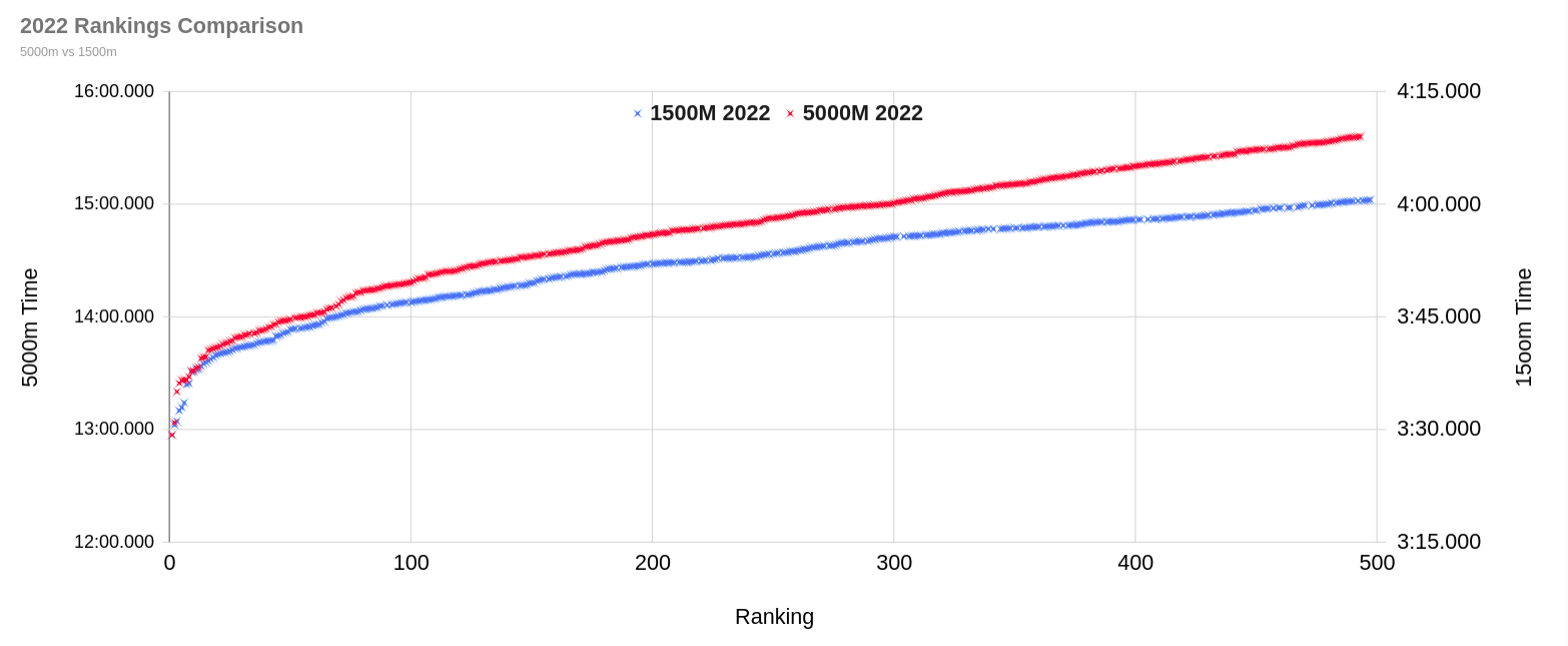
A few interesting points
- Those steps in the plot do seem to be around time barriers, perhaps the knowledge that a fast time is on really pushes people in those final laps.
- The top 20 really differentiate themselves - anecdotally it seems most of these times come from fast races abroad
- 14:00 ~= 3:43.6 and 15:00 ~=3:55.6.
- It seems like being close to a time barrier (ie 14mins for 5k) can help push times below the curve.